 Jarvis on John Currin
Jarvis Cocker reveals why he had to have John Currin's work on Pulp's album sleeves...
I first came across John Currin in 1996, in a book for an exhibition called Wild Walls. I was sent it because it contained work by Turner prize nominees (I had been invited to the Turner prize that year). It was Currin's work I liked. That same year I was in New York and went to the Whitney Museum, because I had heard it owned some of his paintings. There weren't any on display, but I found a book in the shop and bought that instead.
I liked the fact that Currin was doing figurative painting, which for a long time wasn't where it was at, and that his work had a sense of humour. Also, he wasn't being nostalgic: to me he was saying something about contemporary states of mind.
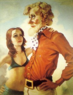
At the time I was in a fragile mental state. I had attained an ambition in life and found it wasn't all it was cracked up to be. So I was struck by Currin's images of powerful men. They are surrounded by women who seem to be sucking up to them but really they're thinking: "What a jerk!" They're always old blokes with beards and young women; that resonated at the time. I especially recognised his Martini Man advert paintings - the works he did using adverts from Penthouse and other magazines. He would take these photos of men in swimming pools, surrounded by bikini-clad women looking on admiringly, but then paint over them so that the women were grimacing. One of those paintings was used in the flyer for his first exhibition at the Sadie Coles gallery in 1997. It looked really good.
Reading about Currin, I noticed that he and I have the same birth date. It seemed significant in some way. I felt I had to track him down, which makes me sound like a stalker. After his show at Sadie Coles, I decided to get in touch with him and ask if Pulp could use his painting The Neverending Story (pictured above right) for the cover of the single Help the Aged. After that, I got in touch again to see if he would collaborate with Pulp on designing the album sleeve for This is Hardcore. Initially I thought we would just use one of his paintings, but the sleeve was also being designed by the Peter Saville studio, and Saville thought it would be more interesting to produce something original. The cover turned out to be quite unusual for Currin because he's a painter and the images he ended up producing are photographs.
Saville got Currin to come up with scenarios for the sleeve. The pictures were shot in London's Hilton Hotel, which is supposed to be a luxury place but in fact it's a bit tacky. His pictures showed people in luxurious settings not really fitting in properly - which at the time really fitted in with what the band was talking about. Without being too literal about it, he communicated the general discomfort that was being felt by Pulp.
Currin's paintings have moved on a lot since I first saw his work. They were never exactly sensational but now they're more subtle. He used to paint quite crude images of women with big bouncy breasts; after that he moved into a new area. For instance, Honeymoon Nude, my favourite, is a simple image of a woman on a black background. She's nude and holding her hands in a strange way.
Some of his works are quite funny, although not in a ho ho ho way. To me, they're not grotesque - some of them are quite beautiful. They're technically very well done, with almost a fairy-tale element. But it's different when you get to know someone; you react to their work slightly differently. In any case, I don't really go in for too much analysis. I'm not equipped. Paintings either do something or they don't - like a song you hear.