 'Living Dolls' by Hugh Aldersey-Williams
Extract taken from New Statesman Magazine, 8 May 1998
'Living Dolls' by Hugh Aldersey-Williams
Extract taken from New Statesman Magazine, 8 May 1998
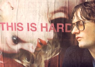
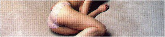
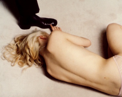
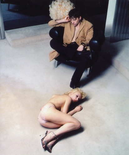
If Humphrey Bogart ever called some broad a real doll, you could be pretty sure it was a compliment. But times change. It's a real doll that has got the band Pulp in trouble over their latest album. The cover of This Is Hardcore shows a naked woman draped, or possibly flung, across a puce leather sofa. Is she alive or dead? Is she in fact real, or is she perhaps a blow up doll? Protesters didn't hesitate to wonder. Posters on the London Underground were defaced. Usually liberal newspapers were stirred to editorials of condemnation. And it might have been worse. "Our first proposals for posters on the Tube and on the backs of buses were rejected, which is a triumph really," gloats Peter Saville, the designer of the album. "For the whole thing just to have passed without a murmur would have been a great disappointment. To have to redo things is slightly rewarding." Perhaps the Independent On Sunday was in on it. "Whoever designed the controversial poster must be feeling pretty pleased with themselves: it has gained the pop group plenty of extra publicity," the paper fumed, adding that "the woman looks as if she had been raped." Well maybe. But she looks a lot of things, as a letter writer duly pointed out.
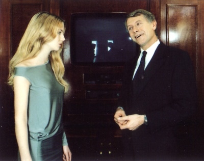
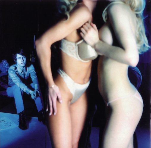
Pornography is simply the most familiar visual language through which we appreciate the disparity between the intensity of imagined experienced and the disappointment or disgust of its realisation. "It's what men in stained raincoats pay for but in here it is pure," as Jarvis Cocker sings. The key to the project was John Currin, a young American painter who's work typically portrays seedy ageing playboys and improbably fulsome women in a hyper-realistic style. Rather than paint Cocker and his confreres, Currin art-directed scenarios in which the members of the band appeared alongside anonymous models, models chosen for their super-real characteristics - the too-amazing body, the too-perfect skin. They look perfect, yet there's something that tells you they are not. The fashion photographer Horst Diekgerdes took the pictures and Saville massaged them with a computer.
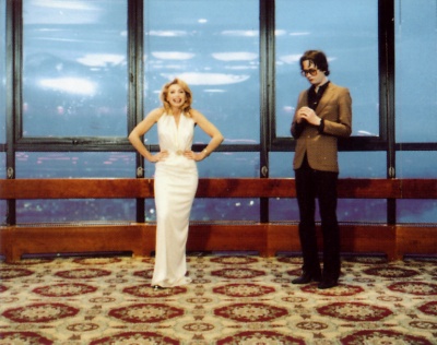
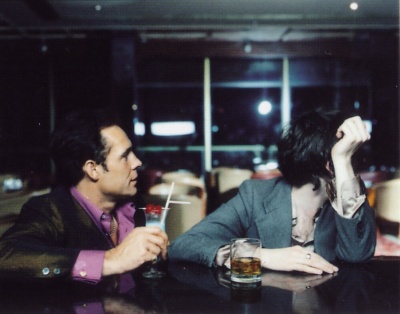
The result is a layer cake of reality and artifice: real model, looks unreal; camera never lies, but the computer embellishes the truth. This is why, even on close examination - especially on close examination - it is impossible to decide about the woman on the album cover. The last stage is the work of a feature of Photoshop software called "smart blur". Like so many so-called graphics filters, its effect is hard to gauge in advance. "We don't quite know digitally what it does," says Saville. "But fascinating things happen between A and B that are not aesthetics-based." At full strength it alters an image so that it looks as if it was painted by numbers. But used gently, it nudges it from photographic reality into painterly photorealism. A couple of less controversial images in the Pulp CD sleeve have this eye-popping quality: Cocker and a matinee idol companion sit at a bar staring directly out of the picture like the girl at the Folies Bergeres; in another, the best of the set, a beautiful girl is sitting on the end of a bed, a luminous angel come to visit the morose band member in the background. Shot at the Hilton Hotel on Park Lane, the banal cameos look like recent work by Richard Hamilton.
Soon the only refuge for fantasy figures and those who seek them will be in virtual reality. For every inch that Barbie has moved from bust to waist, Lara Croft, the gun-totting heroine of the best selling computer game Tomb Raider, has moved from waist to bust. It's a progress of a kind. But what was always true is still true: reality is the disappointment.
The Out-takes
Unused photos from the LP photo shoot (Click on the images to enlarge)
 |
 |
 |
 |
 |
 |
 |
 |
 |
 |
 |
This Is Hardcore
Taken from '100 Best Album Covers', ISBN 0751307068
|
Click on the thumbnails (right) to see a supersize artwork image. Sexy girls on covers rarely have any serious rationale for being there. Pulp's This Is Hardcore is different, even if the intention is not obvious. Hardcore is an expression often used to indicate blatant pornography. It can be used to describe a rock band's desire to be taken seriously about their work. Jarvis Cocker, Pulp's lead singer, intended this cover to illustrate his own internal confusion about being a pop star in isolation - a familiar neurosis of the rich and famous. The title and cover are supposed to be a paradox. Does it work? pulp fact or pulp fiction? THE MODEL: THE BRIEF: PHOTOGRAPHY: LOCATION: PRODUCTION: THE PAINTERLY EFFECT: THIS IS NOT PORN: THE TYPEFACE: OUTRAGE:
Art Direction: Peter Saville & John Currin |


|